- Stephen
Tremblett - Portfolio
2018—2023 - About
- Email
LinkedIn
In an industry that is often filled with stagnant, and boring, competition, Y Station wanted a look to break a part from the crowd that would help attract younger and more modern audiences for their research efforts.
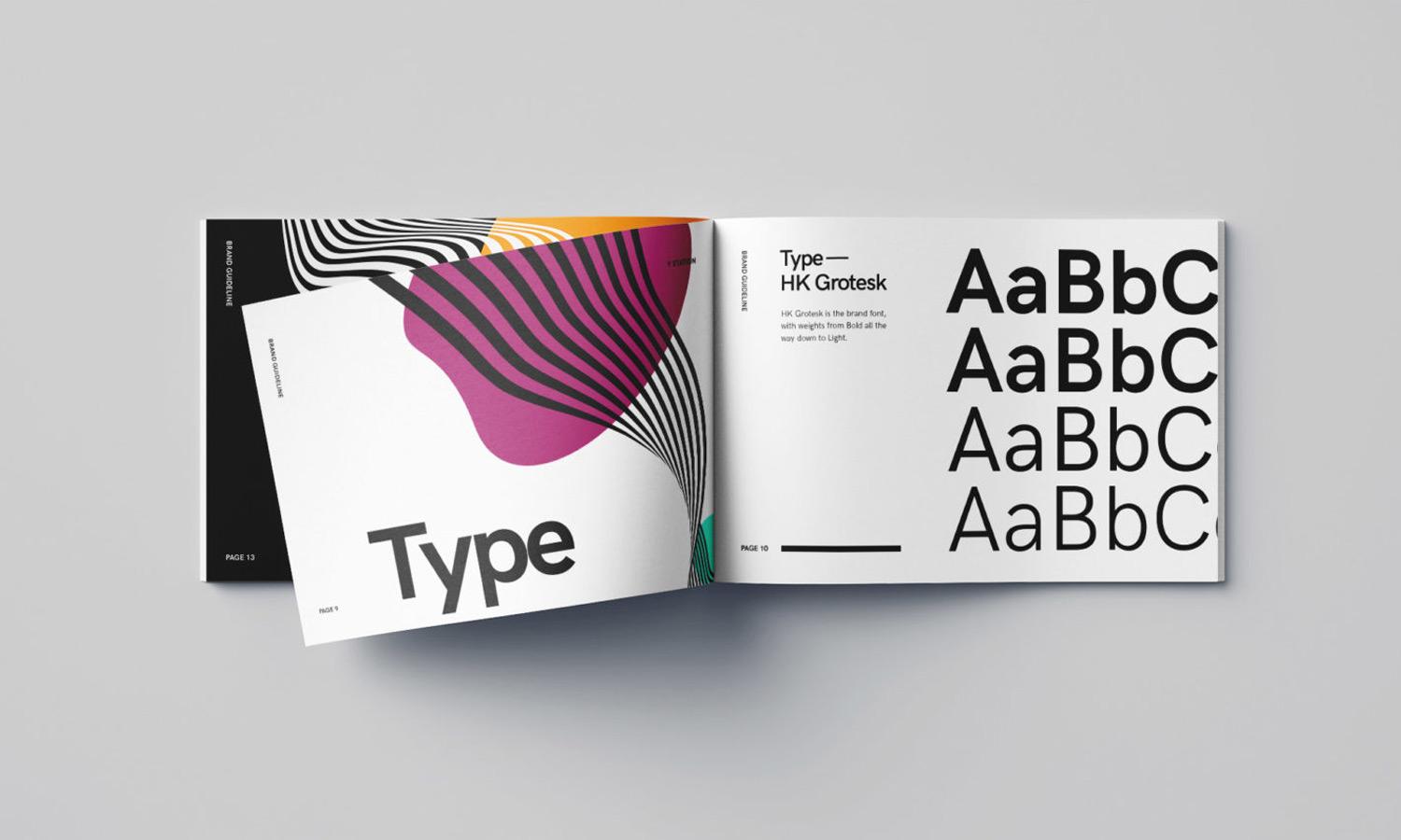
The design of the logo was kept simple, modern, and bold. The open rectangle shape in combination with the letter "y" serves as a message bubble, signifying their work in communication, surveys, and opening up a dialogue from their clients to the groups they survey.

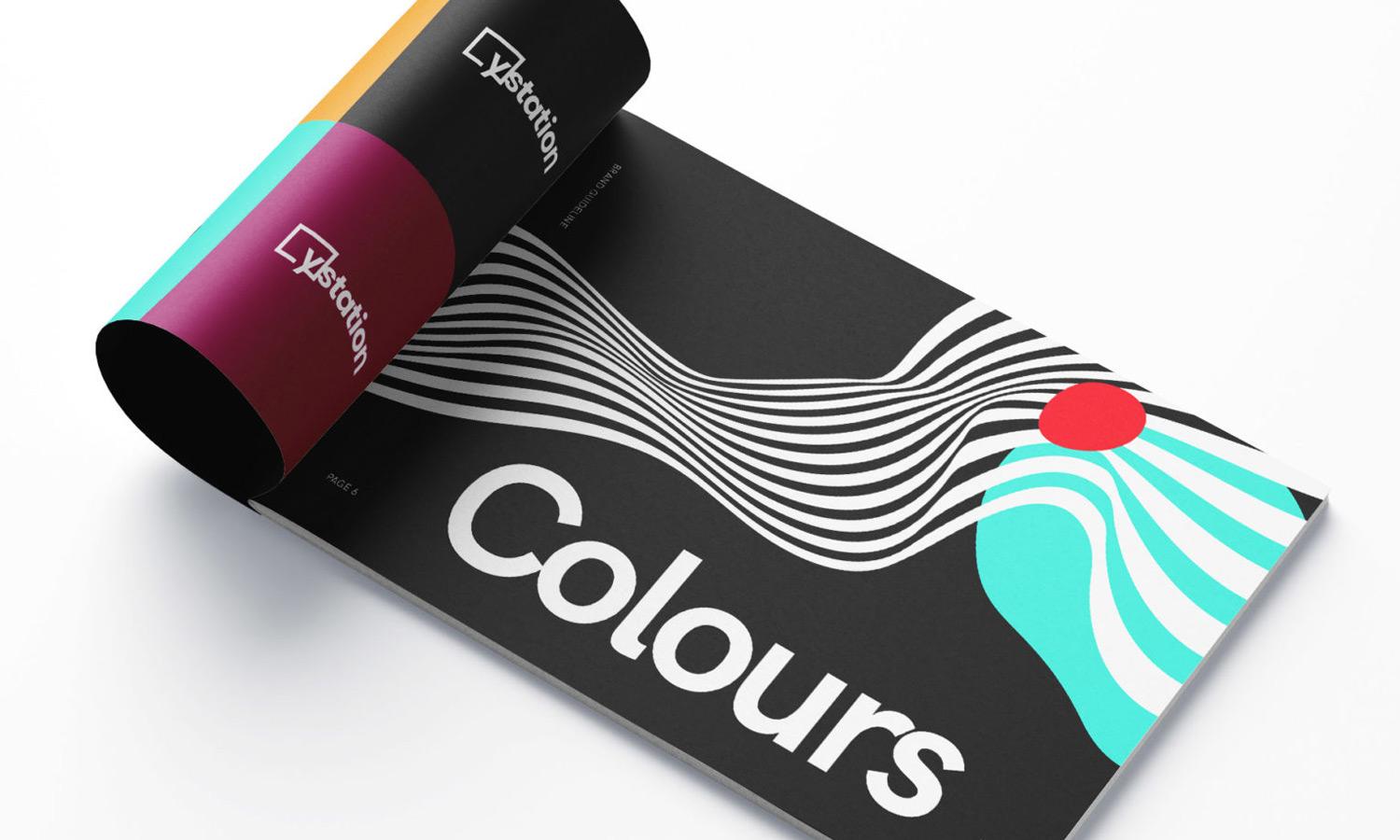
The Y Station name is a reference to the towers used in WWI and WWII that fed signal data and other intelligence to Allies, informing crucial decisions.
Abstract wave lines are used as a symbol to data waves, with bright colourful circles meant to be areas along these waves acting as significant data points. The result is a fun, modern visual element used throughout designs.