- Stephen
Tremblett - Portfolio
2018—2023 - About
- Email
LinkedIn
Laura Poburan is an expert guide and mentor to fitness coaches, and one that tends to break the mold by providing raw feedback and advice to her clients. With a heavy focus on social media, videos, and pocasts, Laura needed a brand that was bold, stood out, and most importantly reflected her own personality.
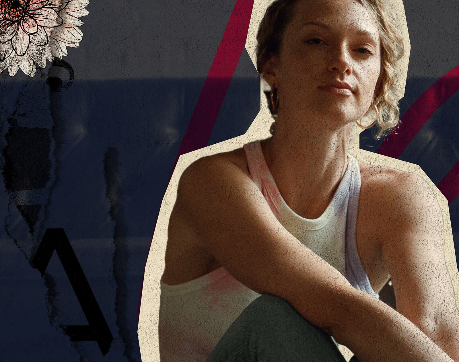
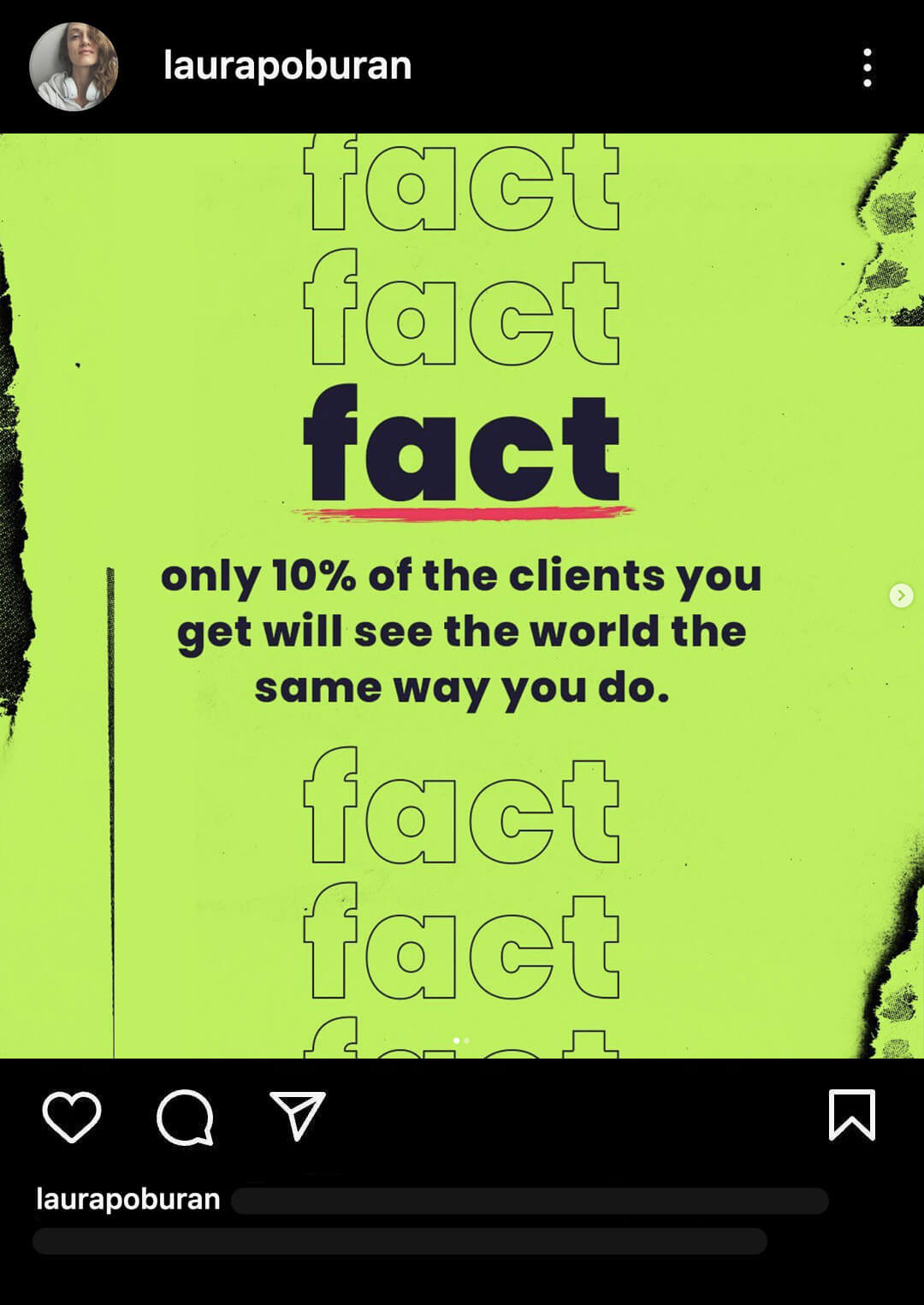
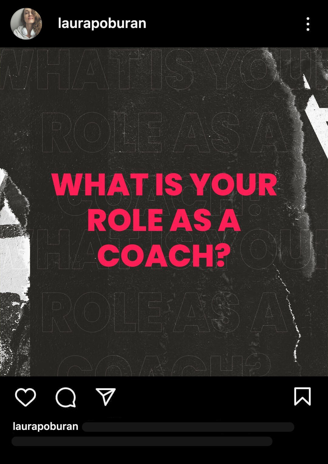
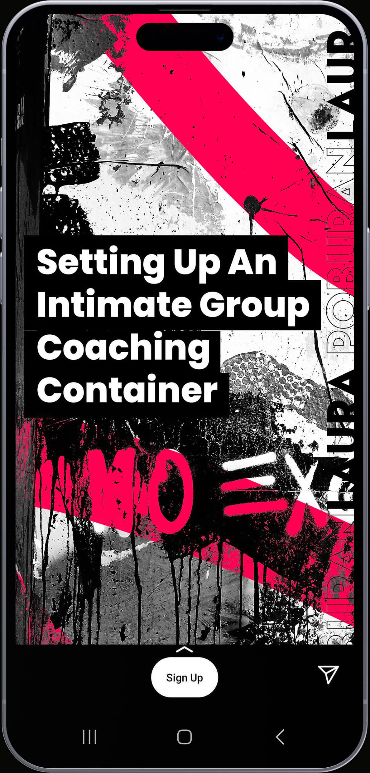
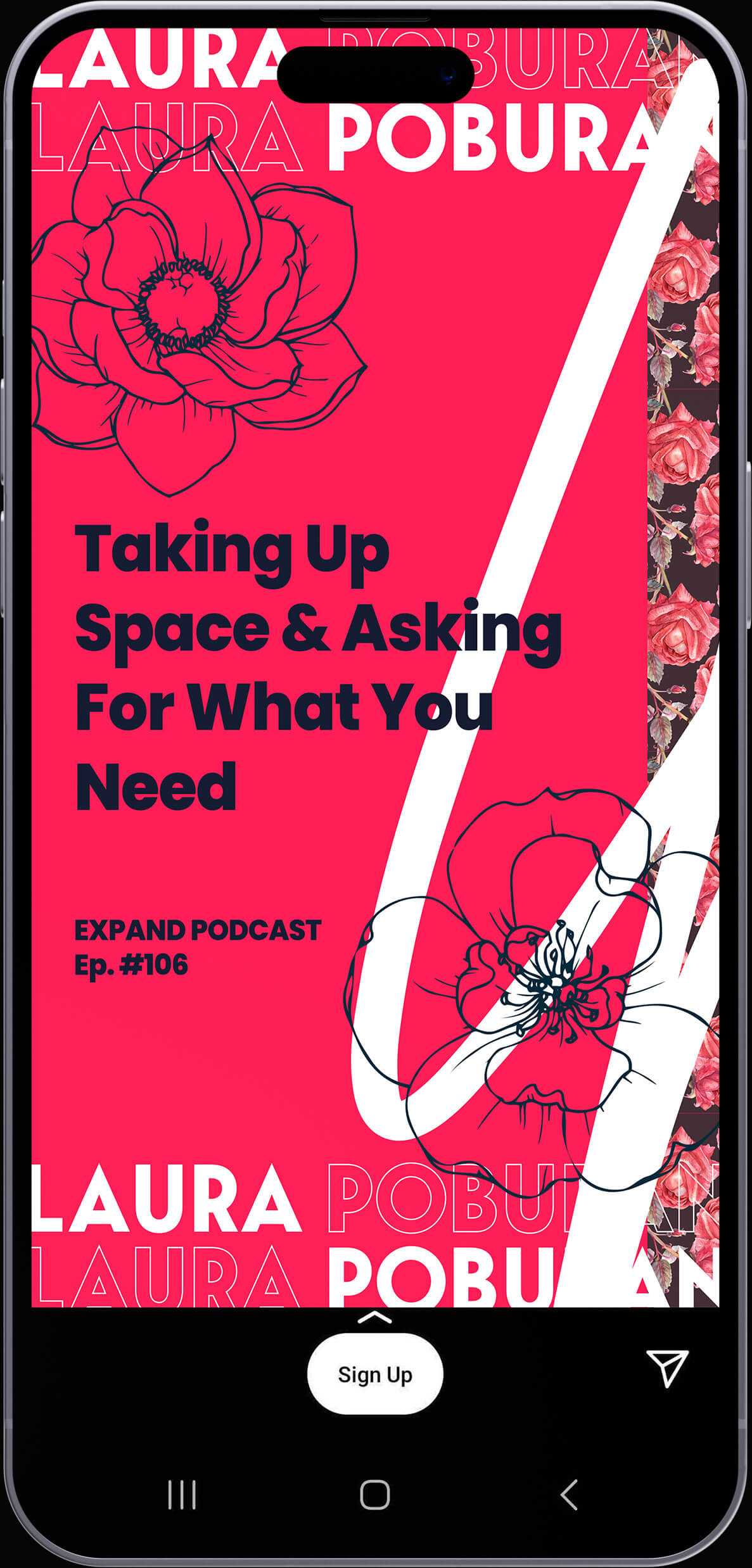
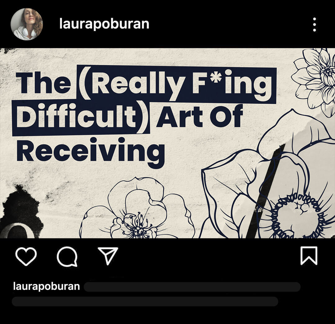
Utilizing a mixture of textures, flower graphics (among other elements) a layered and almost grunge like aesthetic was created to give off that bold feeling. Somewhat modern street inspired, the idea was to create a look that was distinctly hers that set Laura apart from the saturated market of coaches.
The approach to this aesthetic was to match Laura’s services that provide raw advice and feedback to her clients, something that isn’t often clean or polished.
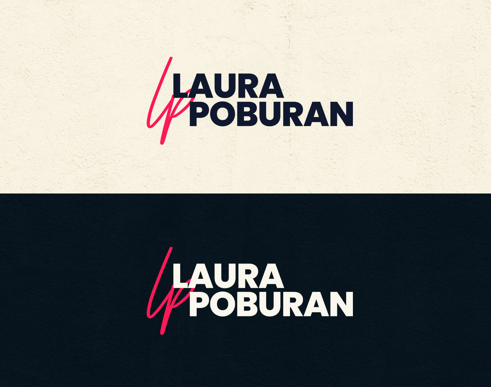
Laura wanted a simple logo, something that didn't feel too flashy or overly designed. The result was a logo that felt like something that belonged to streetwear, with a simple handwritten initial underlayed an offset typography treatment.
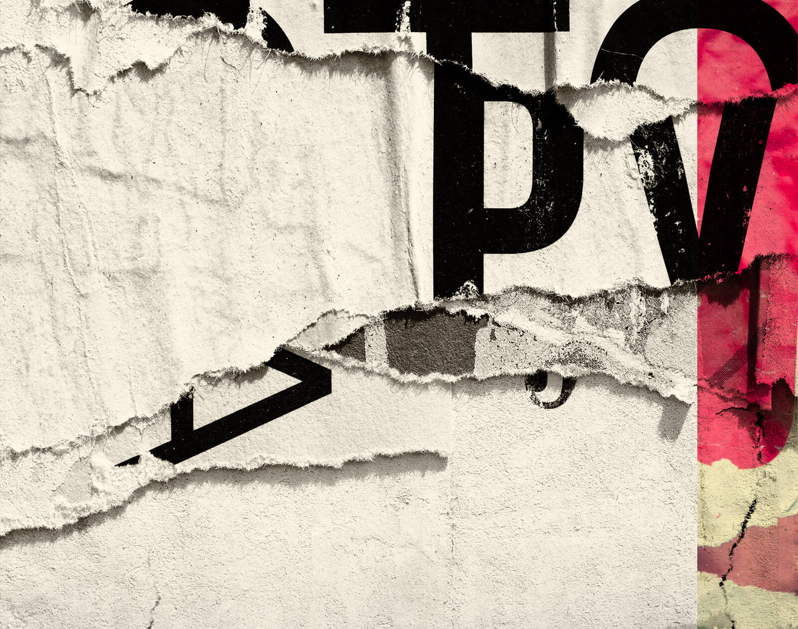
To give off a bit of that modern street aestethic, rough textures were used to add a raw and authentic look to the brand. Textures are often overlapped, and used in a combination of hard edges and more subtle blending.
To contrast the roughness of the textures in a design flowers were used to bring in a dash of softness to the brand, but not in a way that felt overly feminine or too "cute."
These were styled as if clipped out from a magazine, often with a jagged border around them. Outlines for flowers are used as well, either on their own or in combination with realistic flower photos.

As is the case with most brands, photography was utilized to really help boost the brand's look and feel. Photography of Laura was used in a multitde of ways, from duotones to isolated.
Photo edits like grain and noise were ocassionally used to better match the visual feel of a design